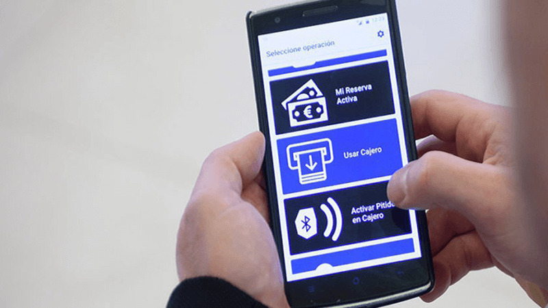
There will be 117 million blind people around the world by 2050, an increase of 38 million from 2021. If you are an app developer operating on a project that you hope is likely to make it big in the future, you do not want to cover the large chunk of the visually impaired audience which can benefit from your product. Making an app visually impaired friendly improves the overall UX in more ways than one.
Good UX can plunge the future of any product towards success. Talking of the visually impaired, UX needs to be experiential, affective, and significant as far as app communication is concerned. As tiresome as it might sound, designing mobile apps for the visually impaired is easy. There are simple and low-cost ways that all app businesses can leverage to make their apps visually-impaired friendly.
Best UX Design For Designing an App for the Visually Impaired
1. Size of Text
It is a standard method to use the ‘zoom’ feature to read the text on an app for people. However, having to resort to ‘zoom’ time and again incurs time in the app session and destroys the user experience on the whole. If it is hard to read for people with normal vision, it is apparent that it needs to be re-touched for the visually impaired.
Do not shy away from using enlarged text in abundance when designing an app for the visually impaired. Moreover, you can give your weak-sighted public a manual option to adjust the font size of the text on the app according to their choice and comfort.
2. Color Coding & Textures
The magic of color-coding a message would be lost on someone who is visually impaired as they can hardly detect the color changes on the screen. This is the principal reason why a UX designer must not rely heavily on color to send a message to the end-user if they want to develop an app for all. Furthermore, reliance on colors for conveying a message to a global audience can be tricky as different religions interpret colors differently.
A great option to using color is using texture to differentiate one element from the other, creating an indulgent experience for your user. Even normal-sighted users would find the use of texture in the app aesthetically appealing.
3. Code for Sound
Another option to color-coding your messaging and information to the user; is to use sounds. Add different sounds for simplest activities like navigation from one opportunity to another, change of screen and incorrect passwords. This helps a visually impaired user form a good interactive relationship with your app product as they feel for informed about app activities.
4. Dark Mode
It is best to combine a dark/ night mode in your apps. If you have a text content-driven app, it would be more comfortable for the visually impaired audience to read it when it is placed out in lighter colors on a dark background instead of the opposite. If you are designing an Android app, the dark mode can be a game-changer for your UX. However, if you are designing for Apple be sure to make your app product fit with the company’s latest ‘Smart Invert Color’ feature, which changes the UI keeping the images and icons intact.
5. Screen Reading Tools
Screen Reading tools like VoiceOver and TalkBack come built into iPhones and Android handsets respectively. They promote product communication with blind users by aiding them in hearing what’s on the screen they are unable to see. As an app developer, you must ensure that your app can at least complete main tasks with the help of these tools.
6. Deliberate Hierarchy
Picturise yourself as a user communicating with a text-rich app page, do you read it all at first glance? Or you try to configure which part is the most significant in the content through looking for the title etc, to make better sense of it? Screen readers must allow the visually impaired to figure out the most important content of the page first. To create such a hierarchy, iOS developers use headings, break down the text into categories for easy navigation.
7. Add Alt-text for images
Images are attached to text content for better consumption. However, when a visually impaired user consumes content with the help of a voice search tool, he only hears the word ’Image’ instead of a variety of what is described in it. This makes it important that developers working on an app for visually challenged label their images. A proper caption to go with the image improves the user experience for the blind and adds value.
8. Descriptive Language
Since the blind users use all the information on the app through in-built screen readers, it is the accountability of developers to guarantee all the information is available for them as it is for the users with normal vision. Include simple text that lets a blind user know what you require them to do and what is happening on the app.
9. Button Labelling and States Loading
Conveniently, screen-reading tools read the text on the app screen out loud to the visually impaired audience. However, there still are other details on the screen like buttons and loading stages that need to be interpretable for the reading tools. Developers must assure that each button is labeled the way the screen reader should read it. All apps have loading states too. If a loading state in an app is left without labels, it can confuse blind users to understand that nothing is happening on the app or it has crashed. Just label your loading states to let the user know that the app is loading and content will be available soon.
Conclusion
Every business wants its app product to be successful in mass production. Sadly, people with visual disabilities cannot use an app designed for a general user. While the needs of low vision and blind users vary significantly, both must be kept in mind during the app design process. A little empathy from a user’s perspective helps elevate the overall app design. An app experience that fares well for a visually impaired individual as well as it does for someone with normal vision is the need of the hour.
Here is a list of simple tools that can help you refine the accessibility of your app design:
a.) io/color: Accessibility tab allows you to check if colors, font sizes, and opacity are clear and readable before you start designing.
b.) Strak: This plugin enables you to check the approachability of your designs directly from Sketch.
c.) Photoshop: Photoshop offers built-in testing for the two most common types of color blindness, deuteranopia, and protanopia.
d.) Skala Preview: It is a go-to tool for developers for seeing what the app designs look like, in real-time, on a device. It can preview designs for people with deuteranopia, protanopia, and tritanopia as well as monochromats.
Thus, a little understanding towards the visually impaired, minute changes in the UX, and accessibility testing can help you bring to life a product that will help the low-vision and blind users as well as helps a normal-sighted person.


